Again I have been doing some research on what are the key elements to make a good looking teen drama movie logo, the font, colour, and positions of the title. As you can see below that I have been tweaking quite a lot in Photoshop to make it look as good as possible.
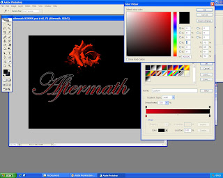
First screen shot shows that I have added two colours to the font instead of one which would make it look boring. And I was just discussing with my Shamedia team if it would look better with the colours of black and red or white and red. And finally decided that red and black looks much better, as the background colour is black it self.
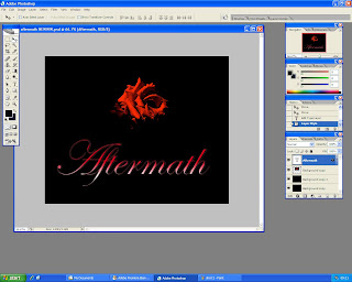
The second screen shot shows that which positioning of the bright flower and the title would look more effective and best for the audience. And so after spending some time playing around with the layer, I have decided that if the title is at the bottom of the image and the flower is at the bottom of the image, it would look really good and professional. I also asked my Shamedia team and some other friends and they agreed with my decision
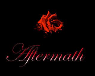
The final screen shot shows the different positioning of the title, which I and my Shamedia team agreed on.


The Final Movie Logo.
Written and Created by Ahmed Mohammed


No comments:
Post a Comment