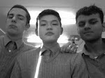
Today people started to comment on our coursework. We corrected a few mistakes and added some music, sound effects to make it a bit more interesting and thrilling. I think our opening is very good and we hope of getting good feedbacks!
Written by Henri Yueksel
Tuesday, 2 February 2010

Monday, 1 February 2010
Tuesday, 26 January 2010
26.1.10


Today we have compered our AS Media Studies coursework with different students around the UK. The one that got my attention the most is Scapegoat. This can be found in youtube.com (http://www.youtube.com/watch?v=aD4ooFNC5yQ). I think our opening sequence of a movie is very good, we have a wide variety of camera angles and techniques.
Written by Sultan Mackinnon.
Tuesday, 19 January 2010
Feedbacks
We have almost finished editing. And we have asked some of the other groups to give some feedback to our unfinished opening scene video on editing mode. Here are there feedback below.
Mrs Downes: Graphics- GREAT
Opening- GREAT
Too much black and white, try to add some saturated colour instead.
Need to be exactly 2 minutes
Aftermath GREAT!
Jenny: needs to have less walking and more colours. Otherwise it’s very good.
I loved the aftermath with the bright red flower.
Vidur: Increase the music slowly at the beginning of the scene. Other than that GREAT!
Pietro: like the aftermath, it looks good the caption should of been in a different style.
Lisa: it’s too long and feels a bit boring because it’s just a guy getting up and walking to some place, however the bit where the girl slaps the guy is amazing.
Kim: needs more info about the girl (Lisa), the rest is all good.
Gabi: I like the bit when Henri raises the knife above his head. As it create real tension.
Written by Ahmed Mohammed
Mrs Downes: Graphics- GREAT
Opening- GREAT
Too much black and white, try to add some saturated colour instead.
Need to be exactly 2 minutes
Aftermath GREAT!
Jenny: needs to have less walking and more colours. Otherwise it’s very good.
I loved the aftermath with the bright red flower.
Vidur: Increase the music slowly at the beginning of the scene. Other than that GREAT!
Pietro: like the aftermath, it looks good the caption should of been in a different style.
Lisa: it’s too long and feels a bit boring because it’s just a guy getting up and walking to some place, however the bit where the girl slaps the guy is amazing.
Kim: needs more info about the girl (Lisa), the rest is all good.
Gabi: I like the bit when Henri raises the knife above his head. As it create real tension.
Written by Ahmed Mohammed
Thursday, 14 January 2010
Media Studies 14.1.10
Today we had to watch and evaluate others film opening giving them feedbacks and trying to find out what we could do better while the others gave us their opinions about our film opening.
The mistakes that we did and what we need to improve are,
- We used too much black and white, nearly the whole opening is black and whit except for one feedback.
- We should take some parts of me walking in the movie and replace it with footage of Lisa Mitchell so the watcher knows more about her while watching the opening.
- We might put a sort of dialogue in the opening because there is none in the moment. But actually that is what we wanted to do, no words but meaningful pictures/shots, so we need to talk about this point again.
- We need to shorten our opening, at the moment it is 2:18 long and our target respectively the given target is 2:00 max. The challenge will be to put some more material of Lisa Mitchell without passing the given time limit.
Written by Henri Yueksel
The mistakes that we did and what we need to improve are,
- We used too much black and white, nearly the whole opening is black and whit except for one feedback.
- We should take some parts of me walking in the movie and replace it with footage of Lisa Mitchell so the watcher knows more about her while watching the opening.
- We might put a sort of dialogue in the opening because there is none in the moment. But actually that is what we wanted to do, no words but meaningful pictures/shots, so we need to talk about this point again.
- We need to shorten our opening, at the moment it is 2:18 long and our target respectively the given target is 2:00 max. The challenge will be to put some more material of Lisa Mitchell without passing the given time limit.
Written by Henri Yueksel
Wednesday, 9 December 2009
New Movie Logo 9.12.09
For the past few days I have been working on the new movie logo. This is because we planed to change the main storyline and so the old movie logo did not suit the opening 2 minutes of our movie. Even our genre has changed to teen drama, where the other one was horror.
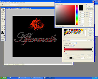
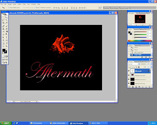
Again I have been doing some research on what are the key elements to make a good looking teen drama movie logo, the font, colour, and positions of the title. As you can see below that I have been tweaking quite a lot in Photoshop to make it look as good as possible.
First screen shot shows that I have added two colours to the font instead of one which would make it look boring. And I was just discussing with my Shamedia team if it would look better with the colours of black and red or white and red. And finally decided that red and black looks much better, as the background colour is black it self.
The second screen shot shows that which positioning of the bright flower and the title would look more effective and best for the audience. And so after spending some time playing around with the layer, I have decided that if the title is at the bottom of the image and the flower is at the bottom of the image, it would look really good and professional. I also asked my Shamedia team and some other friends and they agreed with my decision
The final screen shot shows the different positioning of the title, which I and my Shamedia team agreed on.

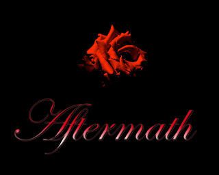
The Final Movie Logo.
Written and Created by Ahmed Mohammed
Again I have been doing some research on what are the key elements to make a good looking teen drama movie logo, the font, colour, and positions of the title. As you can see below that I have been tweaking quite a lot in Photoshop to make it look as good as possible.
First screen shot shows that I have added two colours to the font instead of one which would make it look boring. And I was just discussing with my Shamedia team if it would look better with the colours of black and red or white and red. And finally decided that red and black looks much better, as the background colour is black it self.
The second screen shot shows that which positioning of the bright flower and the title would look more effective and best for the audience. And so after spending some time playing around with the layer, I have decided that if the title is at the bottom of the image and the flower is at the bottom of the image, it would look really good and professional. I also asked my Shamedia team and some other friends and they agreed with my decision
The final screen shot shows the different positioning of the title, which I and my Shamedia team agreed on.


The Final Movie Logo.
Written and Created by Ahmed Mohammed
Tuesday, 8 December 2009
Media Studies 8.12.09
We finally finished our Coursework. There are a few little things that we have to make clear before puplishing it on our blog. We worked really hard because we thought we where far behind everyone but apparently it looks like we finished first. Our film opening looks really professional and we'll wait for some critics from other groups to see where we made mistakes or what we could improve.
Please Comment here
Written by Henri Yueksel
Please Comment here
Written by Henri Yueksel
Subscribe to:
Posts (Atom)